


Vaccination rates by age, race, gender, and more
From SurveyMonkey and Outbreaks Near Me

Three million people per day were vaccinated against COVID-19 this weekend, an indication that the vaccine distribution is accelerating rapidly in the U.S.
Those latest numbers come from official reported vaccination counts, which are tracked at the state and local level and then reported up to the federal government. But because each state collects its own data, the overall results lack much of the granularity needed to understand the vaccine roll-out.
Some states have not collected information on vaccine recipients’ race, and, notoriously, some of the early reporting has shown that people of color are receiving vaccinations at a dramatically lower rate than white Americans. Similarly, reports indicate that wealthier, more tech-savvy individuals are having an easier time navigating the vaccine sign-up websites, which means that vaccines have mostly gone to those who are most well-off, while lower-income individuals are still waiting.
SurveyMonkey and our partners at Outbreaks Near Me are solving this problem by collecting self-reported vaccination data along with critical demographic information to help inform the public about the equity and speed of the vaccine roll-out. Since early February, we’ve surveyed more than 190,000 people nationwide, which allows us to provide estimates for the vaccination rates by week among specific subgroups of interest: seniors 75+; Black, Hispanic, and Asian Americans; workers in the healthcare or education fields; and, of course, Republicans, Democrats, and independents.
We’re publishing our data as a Tableau dashboard available to the public here:

Click through to see the latest vaccination rates by any combination of age, gender, race, education, employment status, occupation, income, underlying health conditions, and party identification.
Every Monday we’ll publish a fresh batch of data, with approximately 40,000 new survey respondents reported each week. Public health experts estimate that anywhere from 70% to 90% of eligible people nationwide will need to be vaccinated in order to reach herd immunity. So far, our estimate of the vaccination rate among those 18 and older is 28.2%.
What else are we tracking in this survey?
At a macro level, we’ll pair our data on vaccination rates with other public opinion data related to the pandemic. For more than a year, we’ve been tracking the public’s concerns about different aspects of the coronavirus—whether they or their family members will be expose to the virus, whether it will hurt their household finances, whether it is hurting the overall economy—and we’ll continue to track those measures as the vaccination rate climbs.

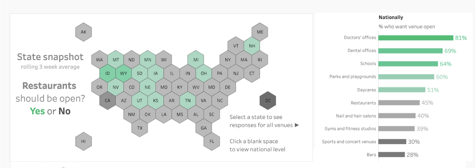
We’re also tracking public opinion about the economy to see what types of businesses and services are most in-demand as things reopen.
Finally, at an individual level, we can examine the immediate impact getting vaccinated has on a person’s life: do people change their behaviors immediately? Do they experience side effects from the vaccine?
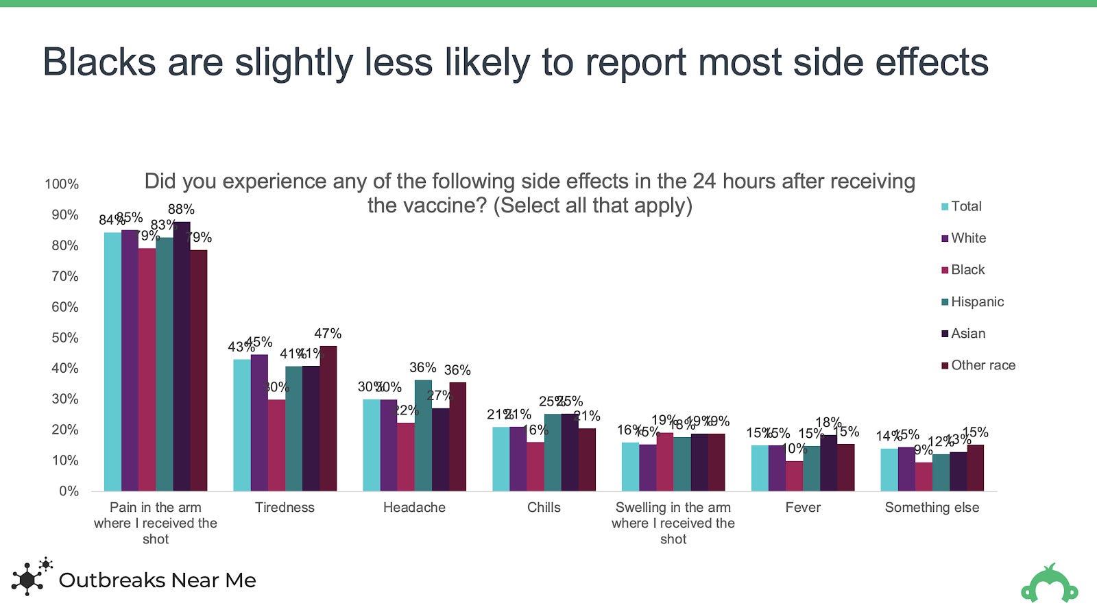
Our data on this last point line up well with anecdotal data: women are more likely than men to report side effects from the vaccine. In our data, women were more likely than men to report pain in the arm where they received the vaccine (87% vs. 81%, tiredness (47% vs. 36%), headaches (34% vs. 23%), chills (24% vs. 18%), and swelling in the arm where they received the vaccine (19% vs. 12%).

Those differences by gender were more substantial and more consistent than any differences by age or race.
Thanks for following along! We look forward to sharing more insights as the vaccine roll-out continues.
Other sources for data on COVID vaccinations:
Vaccine Finder (from our partners at Outbreaks Near Me)